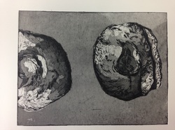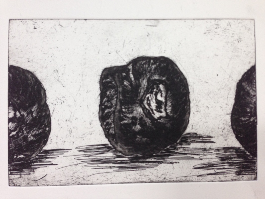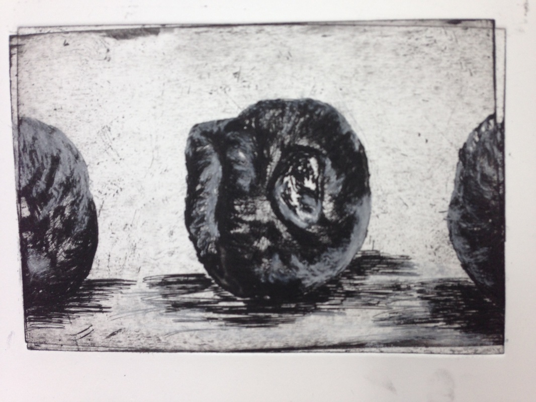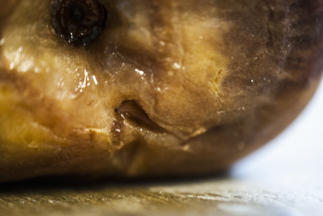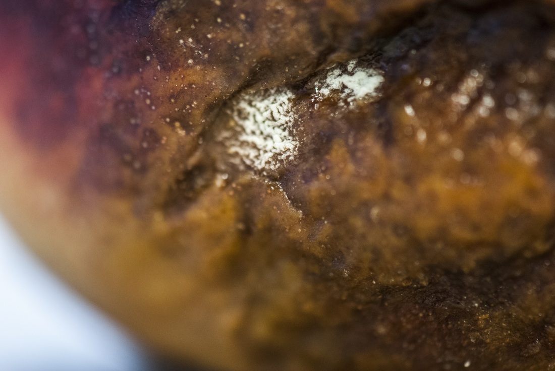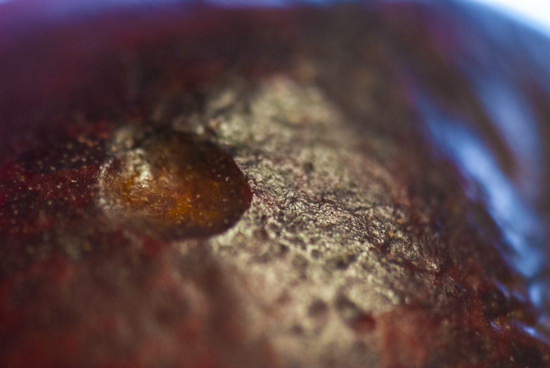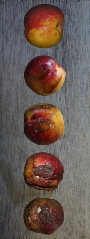
Campbell's work is extremely organic like. Many of her works take on the form of cocoons, structures that could be a home for insects and birds. They present a very naturalist feel to them, even with the bright colours to them. The way the materials she uses, (wire, mesh, found materials), work together to create a translucent network. Again, this network could be shown as steam cells or the network in your brain - which again brings in the idea of nature and humans. The round forms of her sculptures to me almost remind me of a pregnancy bump, and then bring forth the connotations with this. There could be new life forming in these shapes, slight fragility (definitely through the areas with big gaps) and then mortality - you are dying from the moment you are conceived.
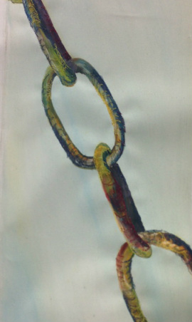
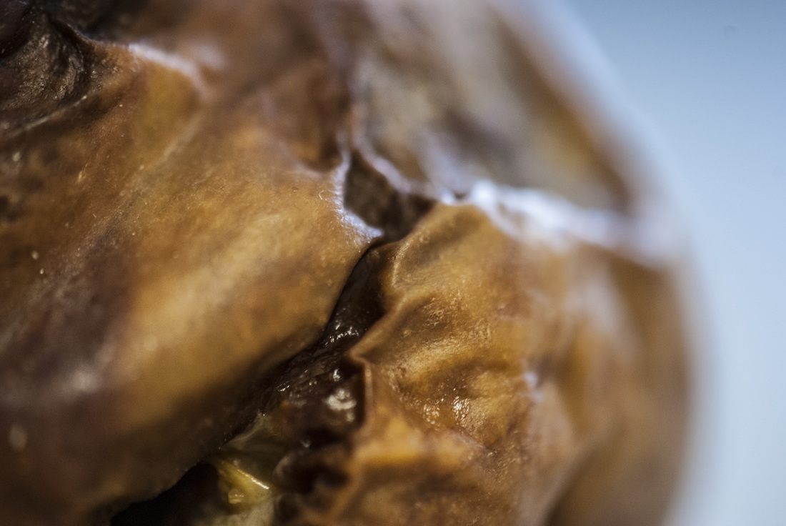
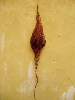
This piece above, "Furry Cocoon" is one of her pieces that intrigues me the most. One a whole it looks like a cocoon, and this is not hard to guess even with the help from the title. In the centre of the cocoon she has built up the wire and mesh and made the middle of it extremely dense. This darkness here presents then the idea that there is actually something wrapped up within it. That this piece has not been man made, but naturally to complete a life cycle. The longer strips at either end, to me, represent an umbilical cord. This stretch of wire is feeding the animal inside, supporting it and keeping it alive as it goes through metamorphosis. The colours in this piece are duller and are more natural hues to what she normally uses. The firery reds and burnt umber suggest two things. One, that this cocoon is a danger to touch, which in nature would be necessary in order to make sure nothing destroys it. Or two, that it has been in this cycle for a very long time, and like the trees in autumn it too is slowly decaying even with life inside it.
This piece above, "Furry Cocoon" is one of her pieces that intrigues me the most. One a whole it looks like a cocoon, and this is not hard to guess even with the help from the title. In the centre of the cocoon she has built up the wire and mesh and made the middle of it extremely dense. This darkness here presents then the idea that there is actually something wrapped up within it. That this piece has not been man made, but naturally to complete a life cycle. The longer strips at either end, to me, represent an umbilical cord. This stretch of wire is feeding the animal inside, supporting it and keeping it alive as it goes through metamorphosis. The colours in this piece are duller and are more natural hues to what she normally uses. The firery reds and burnt umber suggest two things. One, that this cocoon is a danger to touch, which in nature would be necessary in order to make sure nothing destroys it. Or two, that it has been in this cycle for a very long time, and like the trees in autumn it too is slowly decaying even with life inside it.