Once we had finished all of the film, we uploaded it all to the computers and began layering film over film. Similar to the music we were using we wanted to make it very fast moving and busy. In order to do this we: sped up some foraged, played it backwards, changed the colour levels and used repetition. This worked extremely well with the music. However there were a few technical issues with Premier Plus, we ended up using iMovie for most of it. Nevertheless, with more practise it will become easier. Overall the short film works extremely well and the audience seemed to find it entertaining and are able to connect with it. Nevertheless, I found that this video was more suited to my partners taste and style of art, however, it was still good to see another persons ideas and mode of working.
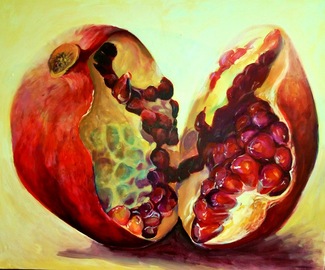
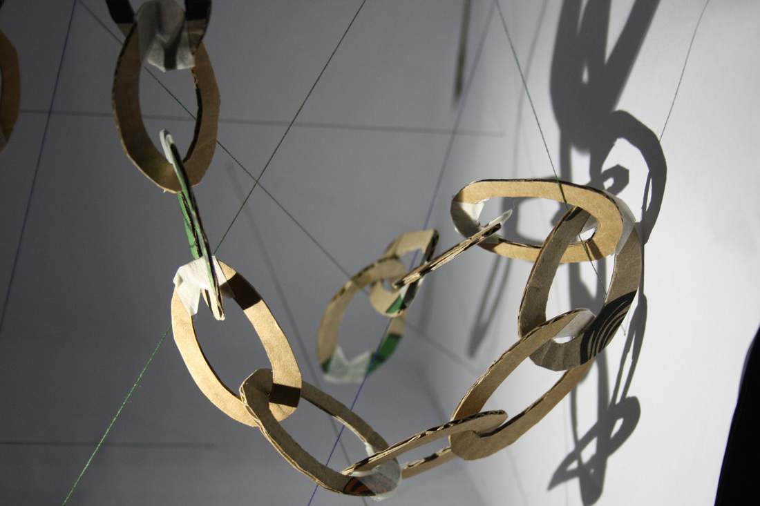
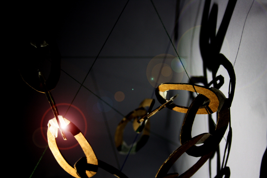
Following on from my recent thoughts on what to do for my 'action for camera', I found that I was unable to do my original idea with my box and shadows. This was because I was not able to obtain a camera that would run for 24 hours. However, once I found that I was not able to do this I began discussing ideas with Tabitha. We then both decided to collaborate our project and work together. We began brainstorming ideas together. We looked at a few videos of performance art by David Sherry and Harrison and Wood. In both of these pieces they included a lot of humour and, at times, seemingly random and spontaneous acts in them. From this we decided that we wanted to create something fun and almost anti art, similar to how Dada was perceived when it first came to light. We started filming everyday things with us in them, walking to face painting. We wanted it to be irrational and let the chance for change to occur within it. While we were looking at sensory things within the work we were doing, it reminded us of the film "Amelie". In this she too finds simple enjoyment out of random everyday things in life. From this we listened to the music from it, use it and work with it. We looked at the influences for Pop Art and childhood. And so again, we filmed more random small clips with these things in mind. Similar to Spartacus Chetwynd we wanted to make some of the props we made look very 'home made' and childlike. This was moving on from last week when we were making our maquettes, we made rough little models to use in our work.
Once we had finished all of the film, we uploaded it all to the computers and began layering film over film. Similar to the music we were using we wanted to make it very fast moving and busy. In order to do this we: sped up some foraged, played it backwards, changed the colour levels and used repetition. This worked extremely well with the music. However there were a few technical issues with Premier Plus, we ended up using iMovie for most of it. Nevertheless, with more practise it will become easier. Overall the short film works extremely well and the audience seemed to find it entertaining and are able to connect with it. Nevertheless, I found that this video was more suited to my partners taste and style of art, however, it was still good to see another persons ideas and mode of working.
0 Comments
I attend the lecture by Simon Fujiwara and it was really interesting to hear him speak of the passion that he holds for the details within his work. However, the most interesting thing which I gained from him was his thought and work progress. He doesn't necessarily seek out his next subject matter but lets it come to him. Once he ha it, he just lets it runs and sees how and where it goes. The piece of work which was to do with his mother and her lover hit a problem, but Fujiwara adapted it to let it continue and make it work. This was very brave of him to keep it going into the unknown.
"Come" is from Kamille Saabre's collection named "The Taste Of Maturity". This is a beautiful painting ion my eyes. As you look at it you can see the flesh bursting apart and you can feel the moist seeds as they lay held in place by the flesh. The colours add to the richness of this painting, bringing it alive. The tropical hues of this painting transport you to somewhere like India where these colours are in abundance. There is 3D form in this work, through the transparent layers and shading of the round fruit. Nevertheless, the simplicity of some of the areas give the illusion that in places it is 2D. This effect on it creates an interesting illusion. I want to try and capture this within a painting I do of my nectarine, and if nothing else, take the rich vibrant colours from her work and infuse them within an oil painting of mine. Photo taken from: http://www.saatchionline.com/art/Painting-Come/391416/224543/view Following on from my thoughts, I bought a nectarine and currently have it in a box on my radiator - I am trying to encourage it to go mouldy. I have been taking a photo of it everyday to show the effect that time has over it. Whilst photographing it I have dropped it a few times, consequently these bruise marks have added another effect to the colouring of it. However, this too is interesting as has resulted in sections of the nectarines weeping. Nevertheless, it is making very slow progress with producing mould. Whilst I have been waiting for this to happen I have been making small observational drawings. Figure 1) I composed this piece in order to see what medium looked best with this subject matter. I found that watercolour worked best as I was able to bleed the colours into one another. Also, where sections had dried quickly, it created a vein / scaly look, which close up looked extremely effective. The middle one looked too grainy with the pencil marks, and will not be using this again. the final one I did with oil pastel. I believe that this does not work well for the plump nectarine as it makes it look old, however, this technique would be much better suited for when it gets old and begins to wrinkle up. Following on from this, I believe that it might look effective if I was to paint it.
From this weeks brief I had two initial ideas using basic cardboard sculpture and so decided to make them both. The first one was three layers of different things progressing forward, in order to create a dimension and shadow. The other piece was a white box with threads going through it and then a piece of cardboard chain overlapping the thread. Both of these pieces created interesting shadows, however, the one with the box created the best. From these two pieces I took photographs and edited them on Photoshop. This resulted in some really interesting compositions for me to work from, from one of the photos I produced an oil painting. I had never thought of using shadow within my work before, but from doing this project I have found how interesting it can be. It changes the scale of things and creates illusions within simple pieces. You begin to question what is and isn't shadow. I am going to explore shadow further in my work to see what else I can produce.
This weeks task is about forming art through the experimentation of making objects and then working from these to compose something else. An example of this is Adrian Ghenie. He makes simple box models then uses lighting and view points to take photographs, and then from these he paints them. Another artist who works similar to this is Matthew Ritchie. However, with his work he looks and plays with shadow. He produces cut outs, sees what shadows form from it and then uses that as his composition, either as a final piece or to then paint from. This idea of a shadow forming part of the composition is what intrigues me most, and creating a small box for these things to be in. From looking at their work I have a few ideas on what to do/ where to go from.
As I mentioned previously, this week was painting. I chose this composition as it had different surfaces that I could explore. I began by using a thick brush to block in the background. I used a flat brush in order to create thicker flat marks. On the right hand section I used a dry brush to make it slightly transparent and to add some sort of texture. This was different to what I normally do as I usually work with thick paint, not on the thin side. However, this way of painting, with a dry brush, created what I felt, and interesting surface and part to look at. I paint in these colours as I like to inject all of the hidden colours, similar to that of Michael Porter. His work fascinates me as he creates these beautiful textures, marks and colours within his pieces. This then led me onto my next piece in which I wanted to explore these different marks that I could make. In the background I added a base layer of brown paper, news paper and masking tape. Again, because I liked the effect given by the dry brush, I made the paint quite see-through in order to see the different textures beneath it. On the top section of the wood this worked really well. This was because the paper underneath was quite crinkled and looked a bit like the grain of the wood. However, the painting style of this one was too loose and so this one was not visually pleasing. This final one was a stark contrast to the other two, and to all of the other paintings that I have ever done. I was focussing on areas and edges of the different elements within the composition. I wanted to get a crisp edge and so I used masking tape to make these harsh lines. Then, again I wanted to strip it as bare as I could to keep the composition simple. This then ended up with me applying my paints very thin. I am really interested with this piece as it is nothing like anything I have ever done in the past. From this outcome I ask the question, can you still tell what the composition is? Would someone else be able to fill it in and bring it more 3D? I believe that they could, so from this I want to take it a stage further to where someone can't guess what it is and leaves it to your own imagination. This has led me to look at Victor Pasmore's work. His work is really interesting, he strips is back to the basics, but there is still enough elements within the work to keep you interested to delve further into his compositions. I think this will be a good next stage/ path for me to follow down. There are so many artists names being thrown into the air, and for someone with poor memory, some of the less famous artists are hard to remember!! Today i bought an address book, here I shall write in all of the artists which i hear about and build up my own list of reference in order to be able to remember them better!!
Today was our first studio practice, and our group is beginning with painting. There are three main things which we are beginning to look at: lines and marks, areas and edges, and layers. Simon said "Paintings are made up of a number of marks made with paint", and that is what it is. However, this week we are intending to strip it back even more, right to the basics and try to understand how a painting is made. Down to: what was the intention of that brushstroke? Why was it that thick/ thin? What effect does the painting being transparent in areas give?
|
Archives
April 2016
Kerry FosterThird Year Fine Art Student at Falmouth School of Art. Fellow artists: |