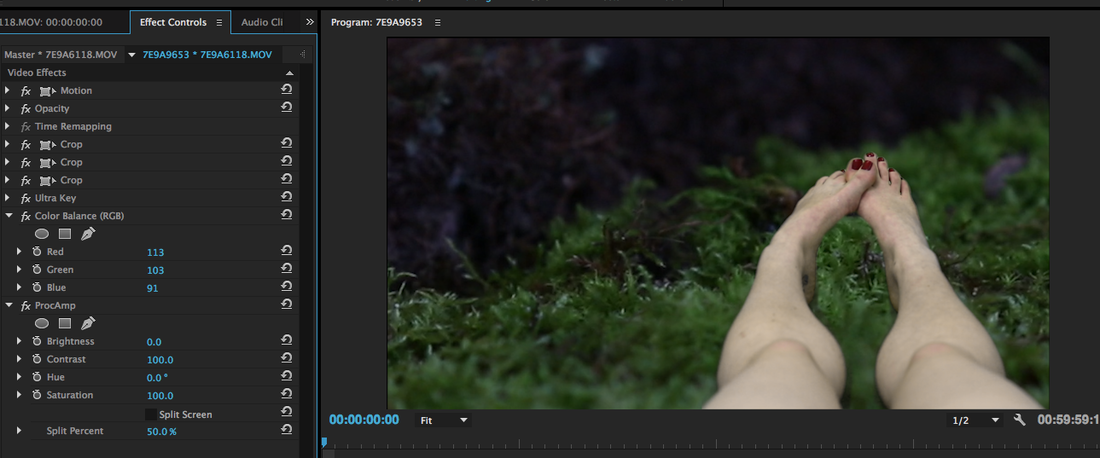
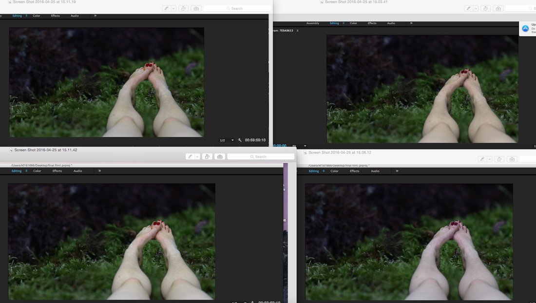
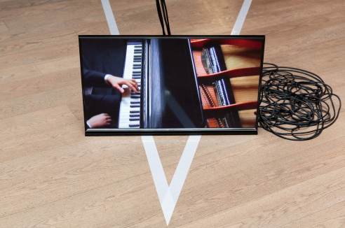
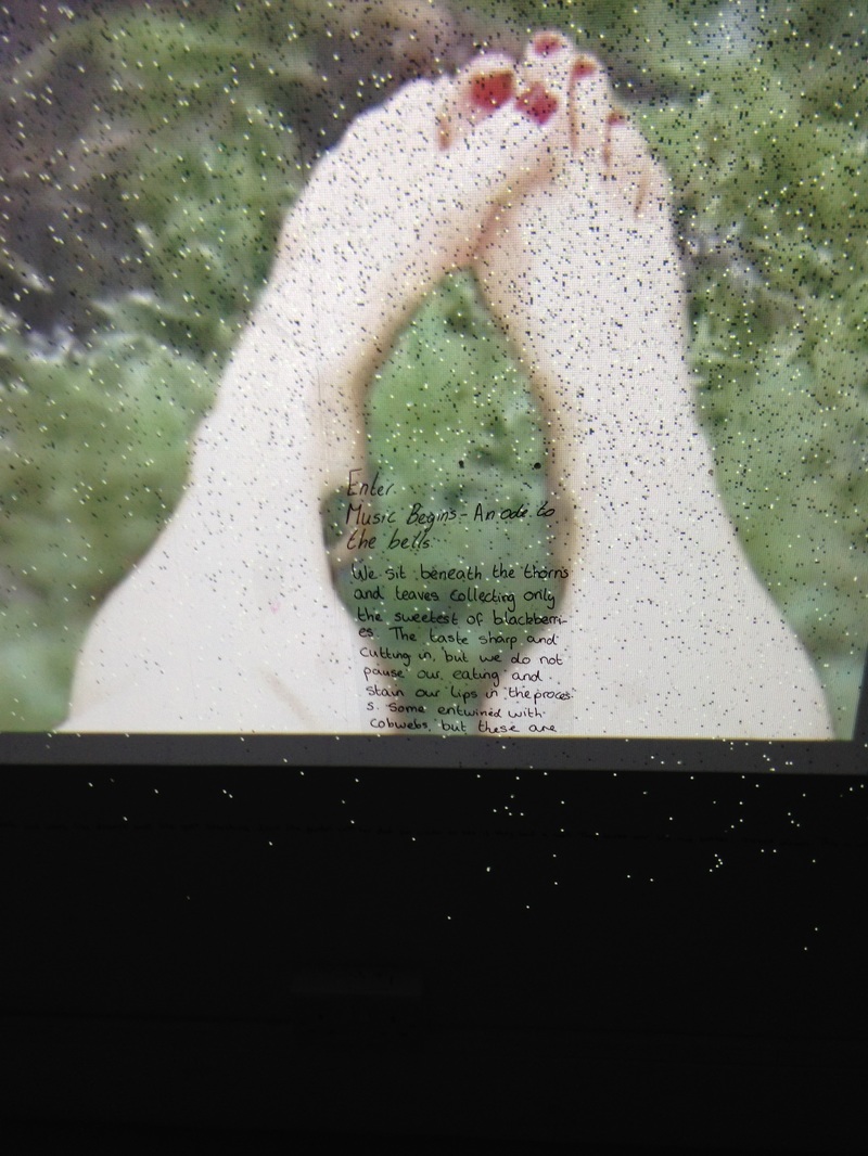
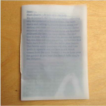
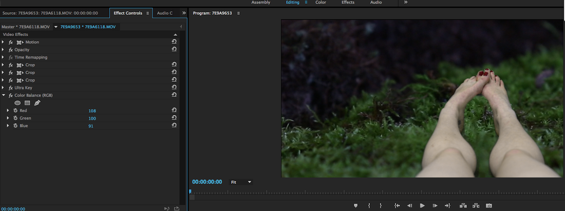
So these are the two that i need to make a decision between. I feel like the top one sits in the background better than the one below. The top one has less colour than the bottom one, however, i still believe that this looks plausible to being an alive human. I feel like the colours of the one below are quite sickly, and in a too much way. I will leave the film for a bit, and come back to this colour decision.
0 Comments
I have refilled and now i'm currently trying to decide what hue i want her. I don't want her to look dead, but i also don't want her to be flushed pink with life. These were some of the different colours etc that i was trying out. When you really up the contrast key, there is an interesting blue hue that comes over the foot. However, i believe the top right one is working best. The reason for this is because of its orange ish shade to it, it gives life to the piece - preventing her from entering into death. Whereas the other ones with their blue ish colour transform her into a corpse, which is not what i am wanting from this work.
Taken from: http://www.arvopart.org/tintinnabulation.html
"Tintinnabulation is a word "which evokes the pealing of bells, the bells' complex but rich sonorous mass of overtones, the gradual unfolding of patterns implicit in the sound itself, and the idea of a sound that is simultaneously static and in flux." Pärt explains the term this way: Tintinnabulation is an area I sometimes wander into when I am searching for answers - in my life, my music, my work. In my dark hours, I have the certain feeling that everything outside this one thing has no meaning. The complex and many-faceted only confuses me, and I must search for unity. What is it, this one thing, and how do I find my way to it? Traces of this perfect thing appear in many guises - and everything that is unimportant falls away. Tintinnabulation is like this. . . . The three notes of a triad are like bells. And that is why I call it tintinnabulation." I love this idea of the church bells being both static and flux. This is something i can easily relate to. They stop you in your tracks to a moment of deeper questioning, you become transfixed. But they also have the gift of bringing joy and memories that flood back into you. This notion proves how poignant bells are, that these great composers have sought after them and their structure to bring something unique and important to their work. Whilst in London I researched a few galleries that i could look round whilst i was there for the day. Heather Phillipson is currently Whitechapel Gallery's Writer in Residence. I decided to have a look at her work as i was interested in her poetry/ writings. Here current work here was about how both our physical and affective selves are constructed and how they might escape. This interested me the most as i am looking into this thought where the inner child in people is still there and how it can escape/ rise up. I want my 'her' to rise up, escape the boundaries that are placed on her by time. That she is able to live like a child that she still wants to be.
Phillipson's writings were casual. She tells you to listen to her in the booklet and places things in capitals. Sections of the book are numbered off and almost categorised. In the zine she also write about this certain type of music, and this mentioned music is then being played around you as you walk through the space. It is sensory full and captivating. I loved how the books were all piled up, there were masses and you could take one away. I really enjoyed this aspect. And even though there were so many aspects, they all bled into each other and sat perfectly in place. So this was the first one back since Easter break.
In a short amount of time we got things covered and i got confused with where to go next! I have decided that i will spend the rest of this time refining my film, to bring it to the standard i want. I need to really focus on the bells sound piece and figure out what i am doing for that. At the moment i am thinking of having them toll 12 times on the minute. But i don't know if that will be too much, however, i want them extremely quiet - so perhaps that won't be a problem. Ideally i need to practise the film being shown with the sound to see how it will all work, but as always, ALL of the installation rooms are booked up! Gillian suggested i also book out a plasma screen and a cube monitor, as i may want more than one film showing. Perhaps. However, i shall still get these out. We spoke about the drawing a presence exhibition up at the minute, each of the artists who submitted to this made a poster that was reproduced and that could be taken away by all of the people looking round the show. This intrigues me. Originally i was thinking that i could reproduce my booklets and make hundreds of these, but i could perhaps just make 8 crisp perfect ones of these and have them placed on the bench. Then on the side, on the way out, i could have a A4 stack of poster type things for people to take away. For this paper i'm thinking have them printed on bible paper. We rounded up the tutorial with the suggestion of me watching 'Six Feet Under' and 'The Witch', the latter looks terrifying and i don't think i'll be watching that! I wrote round the bottom of the room a piece taken out of my zine. It was a continuous line, and the film just touched on it. It was alright i suppose. The issue is just making sure all of the text looks the same. The other issue with this was that you couldn't read the text if the light was off, or you couldn't really see the film if the lights were on to read the text.
So i am still thinking about how to display my zines. I know that i want text work in my final piece, but i am currently unsure how to go about doing this. I have been thinking about, okay, what if i was not to have a zine now? What would i do instead? I thought about writing round the room. I'm going to try this out. I'm going to get some sellotape and put it round a whole room at the bottom and write bits from my zine onto this. I then want to place bits of acetate round the room as though i have written larger bits out. We will see how this goes.
So, after all that i decided to go with a portrait zine A6. It is made of thin tracing paper, folded in the middle and bound with simple thread in the middle. Simple but effective. The order of service style to it suites it well, i believe. It enables you to become a part of the piece, it is inclusive now. You know it is about her, but because you are included you can watch her and go on this journey with her. The grey colour of the writing allows it to not be too harsh or sharp on the eyes, it's gentle and faint. And therefore, you can easily read through to the other side, and it blends well. Again, here i went with single sided pages, so that the text is actually legible. the photos need to be faded more, but they work well being the whole size and just cropped, seeing as all of my work is shot landscape. Having this piece in my hands i see the importance of it needing to be bound if it is to be produced on this type of paper.
I'm not going to lie, the first zine i made was a rather shoddy attempt. I cared more about the content than what was inside. However, i have been trying out little mock up zines in order to see what type of binding i would like. I want to keep it the same size (A6) as it makes it seem like something precious, something that you can keep and look after, and ultimately something that you can always have on you. However, even though i preferred the zine landscape, i am changing this to be portrait. Order of services are traditionally portrait, i have never seen one landscape, and so i wanted to stick to this. Here are some the mock up zines i produced:
I therefore bound one that was page by page. As you can see from it being printed on tracing paper, this one worked better by being single paged. The grey colour worked well too as it wasn't too dominant, but i am just not too sure on the tracing paper.
I have added sections into my writing that make it seem more like an order of service, and actually, i really like this change. However, this has now meant that my zine will definitely need to be seen portrait as this is the way they always look. Another thing with this is that they are never bound. Ultimately, there are only two pieces making up their booklets. However, with mine, i have around 20 sheets of paper, and i just don't feel that slotting it all together will work?! ..But i am enjoying this new format to my zine and writings. My version: "Remain standing and cover ears And the bell rings loudly even though it is a normal day. Her dad needs to do some work in the church and she joins him for the journey. And there is a drain that travels around the church and it is fun to walk in and follow it around. It fills with leave in the autumn but has moss in it at the minute and hidden pincones. Her dad collects pinecones and puts them in the van. Look for pinecones for her dad A few are surveyed by her and collected. She keeps walking around and her dad is sat on a bench talking to an old woman. Her brown clothes drown her. She has a scalf round her head to keep her ears warm. They are laughing. She recognizes her. Together: Good afternoon The lady’s face is wrinkly, and in those wrinkles are dirt. And soil under her nails. Like mine. But she has pink lipstick on. Her nan doesn’t wear lipstick like this lady. She doesn’t know why Miss Phipps wears lipstick. It gets on her teeth. Her Dad told me she has a well down her garden and this is where she gets her water from to drink and wash. She doesn’t smell. I went and recorded the bells again today at my village church so that i had more material to work with.
Bring Back the Bells by Michael S. Rose This is a compelling article about the importance of church bells. They are a unifying force, something that preforms in celebration, mourning and warning. For anyone who has lived in a parish village, the bells are very important to their lives. It denotes a certain home feeling, the sound of comfort. To others though, they can seem something or an eerie nature, just prompting thoughts of death. Rose states that the bells draw people to the church, they act as a sort of homing device. (Perhaps this will draw people to my work). |
Archives
April 2016
Kerry FosterThird Year Fine Art Student at Falmouth School of Art. Fellow artists: |