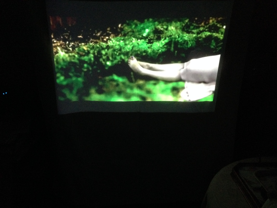
I wanted to project her onto something other than a wall. I wanted the thing or object to enhance her and her in return. The 'theme' of these things to project upon were things that are in your home, as that is where i want her to be.
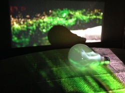 | Lightbulb: I love her feet and legs here, the way they morph over the bulb and become even more distorted. Ideally, i would have her just on the lightbulb, i liked the deformed look to her here. Painting: I chose this as its always been in our family. The lighter parts of her skin and her dress, reveal the painting beautifully, very poetically. However, there is no connection between the two, so i don't feel that it adds anything but confusion. | 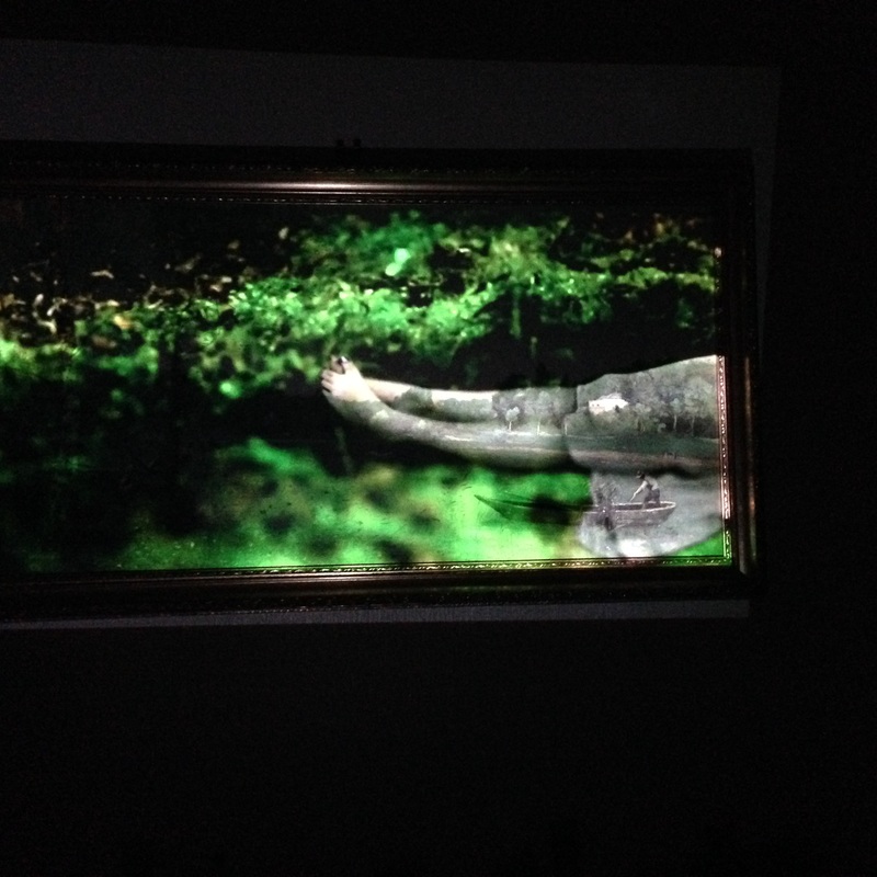 |
 | Onto a wall: This was the standard piece, just onto the wall. Yes okay, it's a good quality projection. But it doesn't add anything. Brick wall: This one was fun. I felt that it was more about the foundations of something, and this one was more centrally about the idea of home. But yet again, the piece still didn't seem right here. | 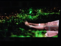 |
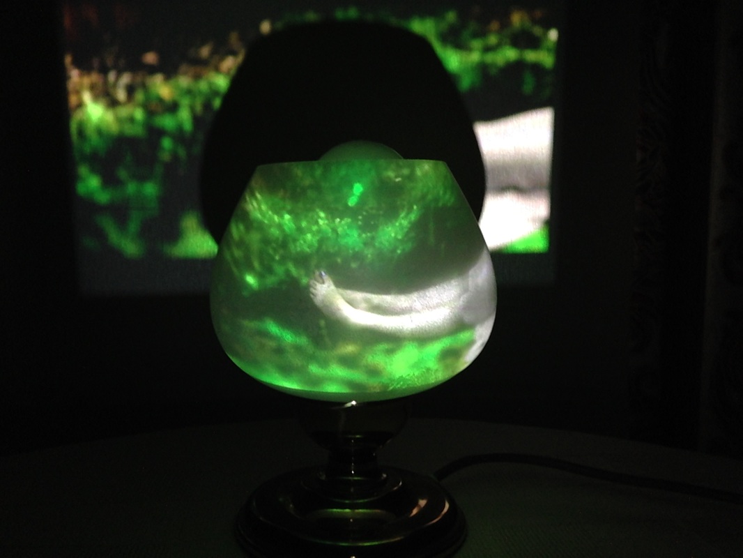 | Glass Light shade: This i similar to the light bulb piece. I prefer this one more though as it is bigger, so the extension of her body is more. It's good how you can walk round it and see it from different angles. However, again, this doesn't lend itself to my work. This made me think i would be fun to project onto a fish tank. | 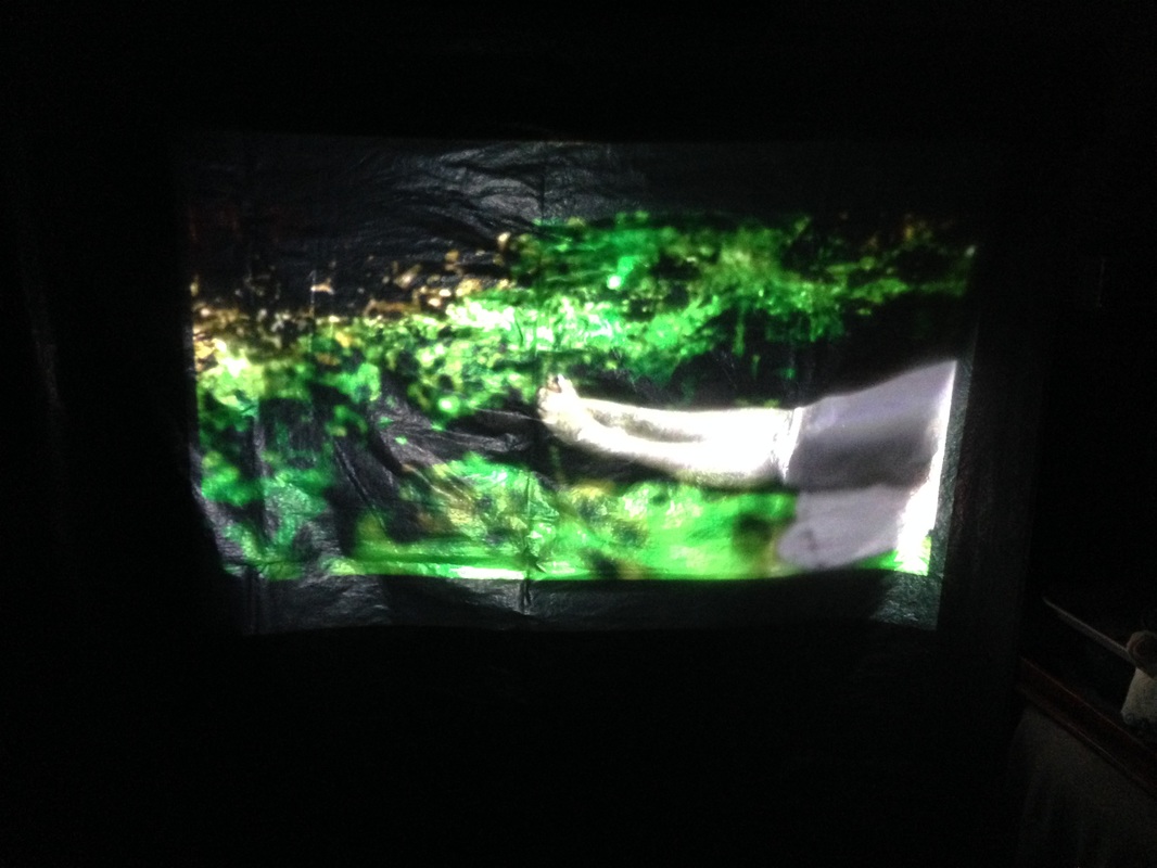 |
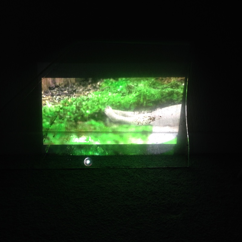 | Dirty Glass: I thought this would come out so much better than it did! It looks greasy and shiny, and you can see the bulb. It doesn't do anything good. Armchair: This is interesting as it adds a textural feel to the work. Nevertheless, the photograph looks so much better to the film! Here she looks cradled, vulnerable. But in the room it just didn't seem right. However, this may have looked different if projected onto a chair that was in more of a studio set up space. | 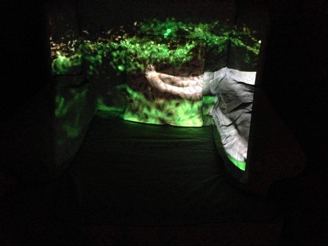 |
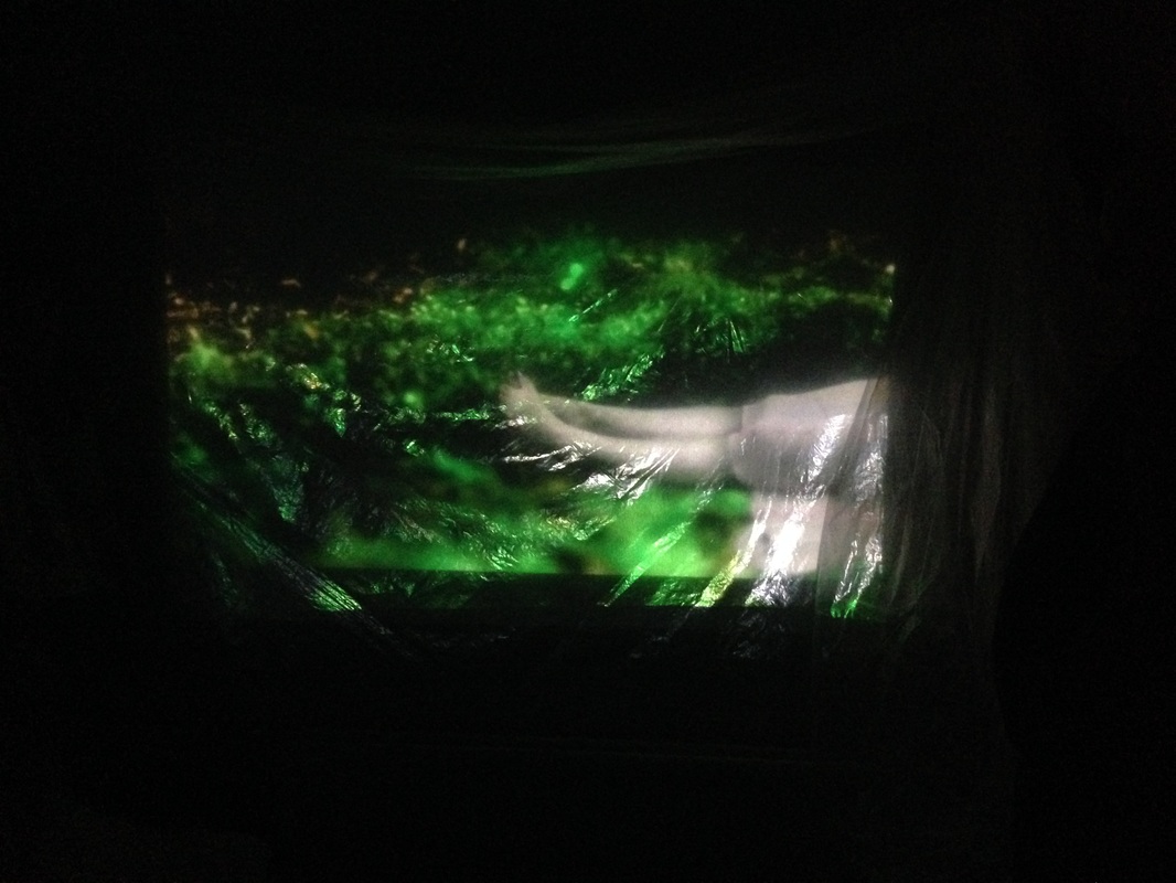 | plastic sheeting: Out of all of them, this probably spoke the best in terms of the work and object in conversation. She looked smothered and film wrapped. This piece was hard compared to the rest. I would explore this further if i wanted to go down the death route, but this piece now made me feel uneasy, there was no sense of slight comfort. shame. bed sheet: as you can see from the photo, just no. It didn't project well and you couldn't really see that it was a bed sheet. | 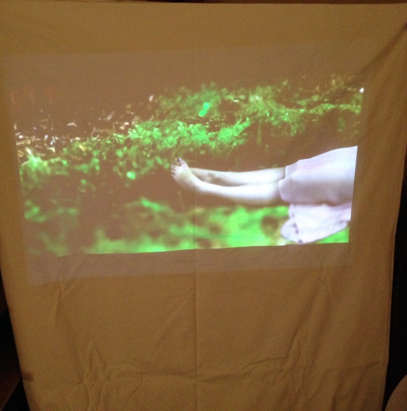 |
